At the heart of every brand lies a visual identity that represents their products or services. Our branding is more than just some visual elements; it is the face of Maritime Optima, representing us, our values and our aspirations.
Today, Maritime Optima stands at a crossroads, ready to unveil a new chapter in our brand's journey. The timing is impeccable, as our app for maritime professionals, ShipIntel, has successfully (and officially) hit the market.
The decision to make changes to our visual identity is rooted in our pursuit of building stronger brand recognition and setting a distinctive tone for our company and products. But our revamped visual identity signifies more than just a visual refresh; they represent a stance. We are here to stay and to challenge, by pushing boundaries, embracing innovation, and meeting the evolving needs of our users.
These changes might only encompass our colors and logos, and may seem minor at first glance, but no matter the size of the changes they will collectively contribute to building a brand for the future, reflecting our dedication to constant improvement.
But why change?
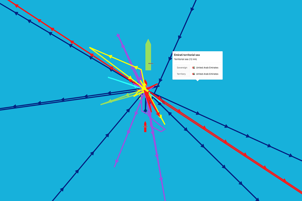
Blue, the color of the ocean, represents our identity as a player in the maritime industry and among those interested in ships. It symbolizes the vastness of possibilities, the reliability of our solutions, and the skills required to navigate complex waters.
In our quest for a cohesive brand identity, we decided to go back to the original blue colors for the ShipIntel application and simultaneously unveiled a redesigned logo for ShipAtlas carrying the same blue colors as in ShipIntel.
This decision was driven by our desire to make a stronger visual connection between our two products and the company, while also making a stronger distinction between the two products and showing our main focus; vessels and oceans.
The Changes
The Company Logo
Before we delve into the changes of our branding, we want to explain how our logo portrays our company and what we do, by sharing our thoughts behind its design. The two dots on the top arc symbolizes satellites flying above us, providing the essential data that keep our applications going. It also symbolizes the satellites that help us navigate through calm or stormy waters and stay focused.
The horizontal lines at the bottom represent the ocean. The two identical, but mirrored, figures in the middle, offer a broad range of interpretations — be it two vessels sailing towards the horizon, the billowing sails of sailboats, or compass needles showing you the direction to a safe port. These figures also serve a practical purpose, mirroring the familiar vessel icons used within our application’s map interface. And when observed collectively you can see the letters 'M' and 'O', the initials of the name of our company.
In the beginning, when Maritime Optima was established, we used our company logo both to represent our company and our first product, ShipAtlas. Back in those days it didn’t really matter, as we only had one product. As our second product, ShipIntel, has officially been launched, we’ve had to delve back into the thinking box.
While we wanted our logo to remain a representation of our company identity, the decision to integrate the original company logo into ShipIntel made us rethink how we will use the colors and symbols of the logo, to better represent the company.
In its monochromatic version, whether in black or white, the logo now represents Maritime Optima, the company. However, when in colors, it will represent ShipIntel, and the story follows below.
ShipAtlas
The ShipAtlas logo has undergone a transformation, diverging from the company's logo while retaining key elements that resonate with our company’s maritime identity; the arc with its satellites, and the sea beneath.
ShipAtlas aims to be the one and only application for individuals and consumers interested in following ships, which is why the actual change of the logo is found in the center, where you’ll now see a ship. We did this to make the logo reflect what the application does, and that is here to assist you, and take care of your interests. By keeping the frame that protects the message in the middle we hope to make it easier to recognise the products coming from Maritime Optima.
The name: An "atlas" typically refers to a collection of maps or charts; a book or a bound collection of maps, often accompanied by additional information such as geographic details, statistics, and illustrations. While supplying you with a vast amount of information, it does so selectively, ensuring relevance without overwhelming you with irrelevant details. With ShipAtlas, users can effortlessly navigate and explore maritime activities with ease, by adding the map layers they prefer and the different types of ships the oceans carry, to get the information they are interested in or are in need of.
ShipIntel
As we now have two products, we wanted ShipIntel to take on the original company logo. ShipIntel was developed to help maritime professionals optimize their decisions by providing relevant information where and when they need it. Like our company slogan; Maritime Intelligence at your fingertips, the name ShipIntel and its blue colors shows our ambitions to give maritime professionals business intelligence to trust, so that they can make more qualified decisions.
By carrying the logo of the company Maritime Optima, the blue colors of the ocean and a name playing on maritime intelligence, ShipIntel aims to assist you in optimizing your decisions.
Acknowledging that ShipIntel's new logo is in fact ShipAtlas' former logo, we recognize the potential for confusion. Yet, we stand firm in our belief that this is the optimal choice for conveying our brand's unity and progression.
Welcome to the world of Maritime Optima. Let’s embark on this journey together - towards the future and beyond.